Craigslist Redesign and Case Study - Home and Community
Arizona State University Case Study
Role: UX Designer and Researcher
Timeline: February 2024 - April 2024
Platform: Web Application (Desktop)
Team: 4 UX Designers
Tools: Figma, Optimal Workshop, Zoom

Background
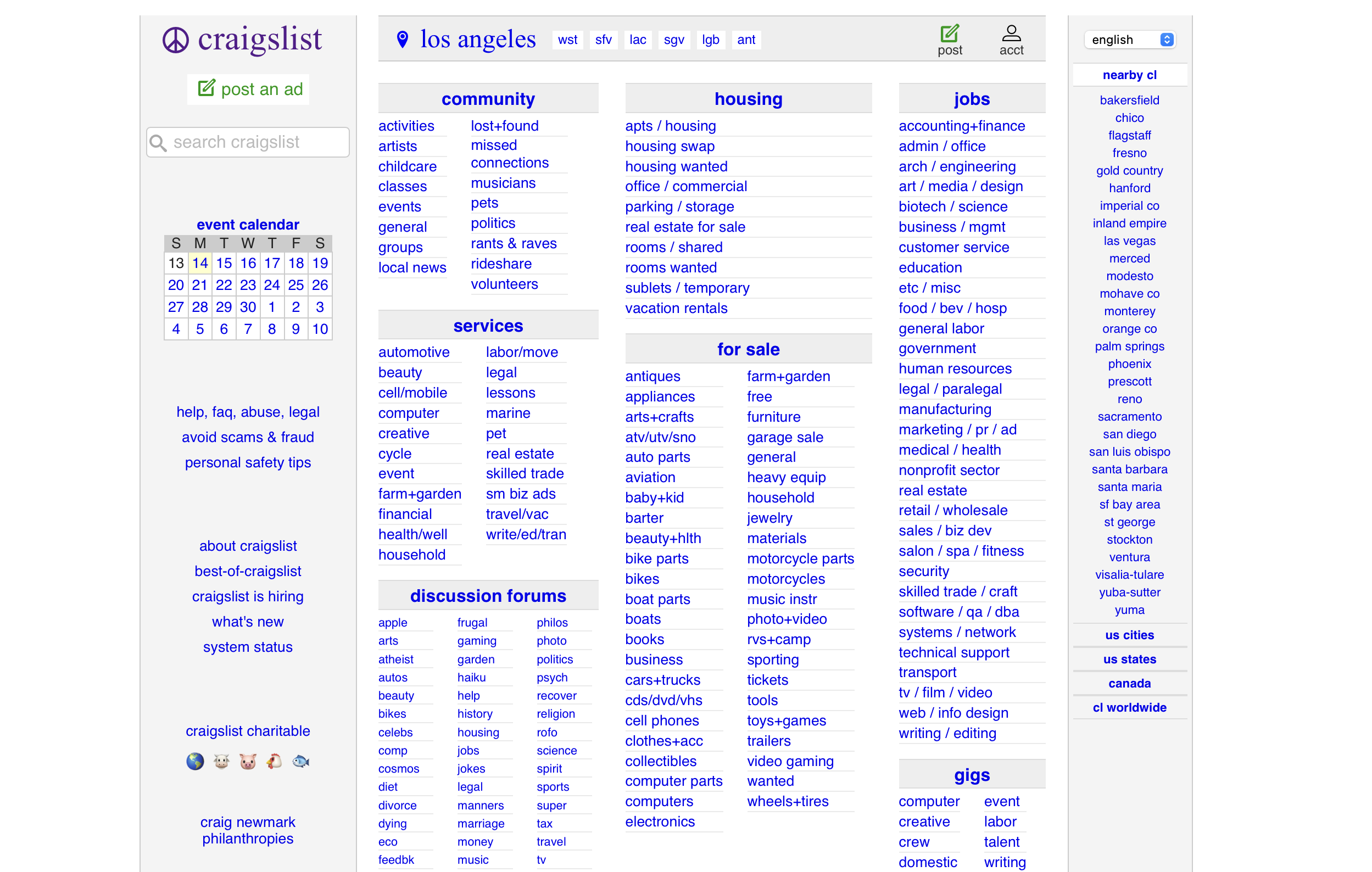
Craigslist is an online classified advertisements platform which facilitates the posting and discovery of various items, services, jobs, housing, and community-related information.
Craigslist’s outdated navigation and lack of visual cues made it difficult for users to understand where they were in their journey, leading to confusion and drop-off.
Challenge
Enhance usability and orientation without compromising the site’s minimalist identity.
Solution
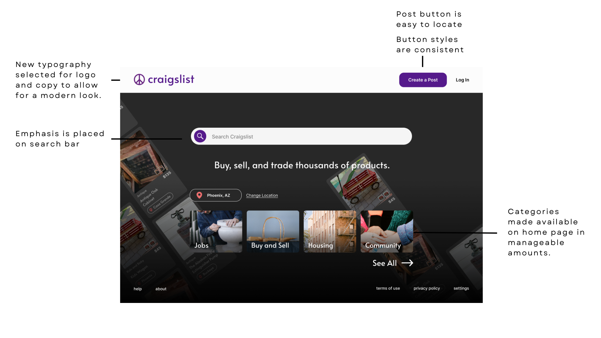
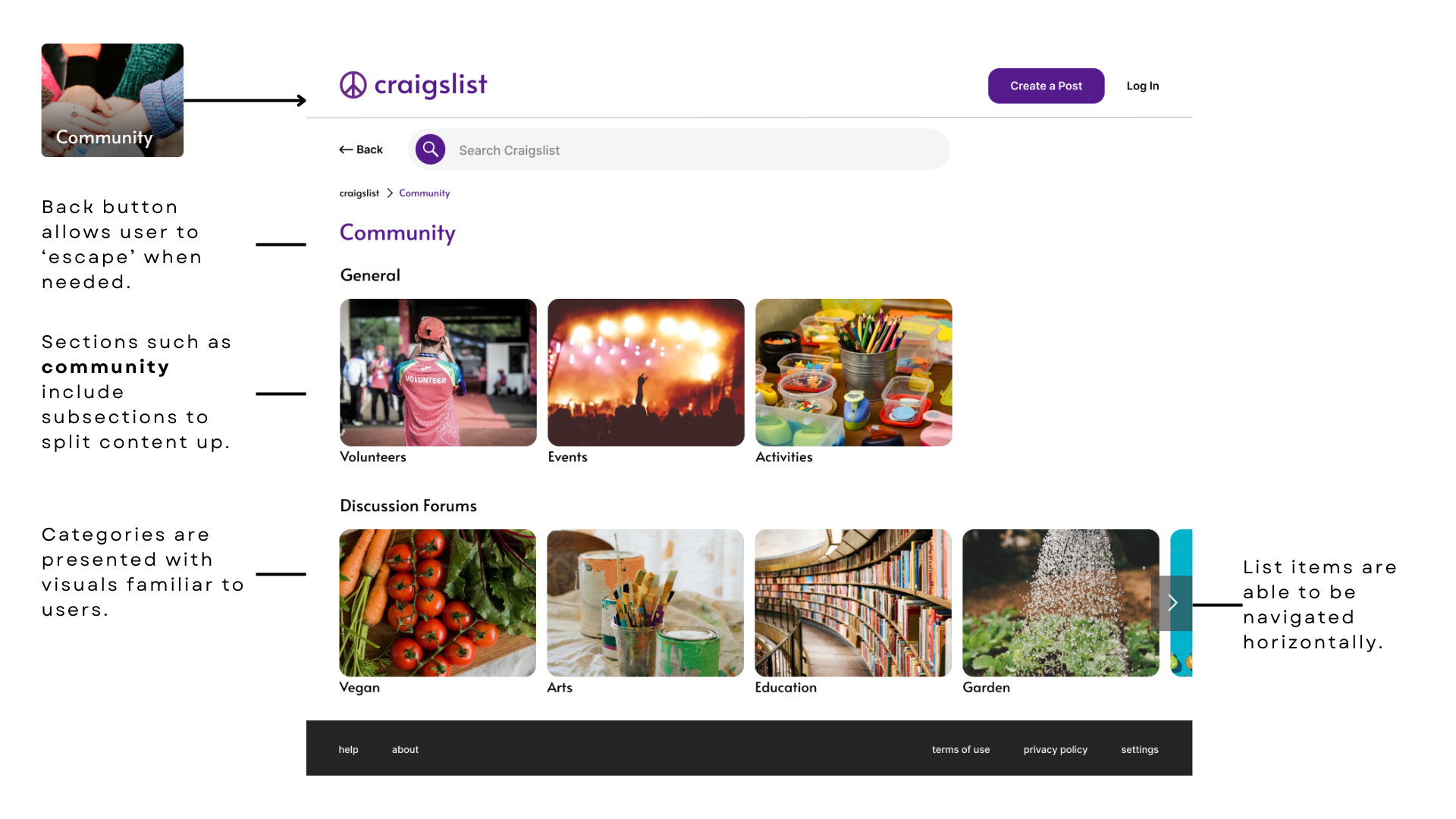
I proposed a streamlined navigation system with breadcrumb trails, clearer category hierarchy, and subtle UI enhancements to improve wayfinding and user confidence throughout the experience.
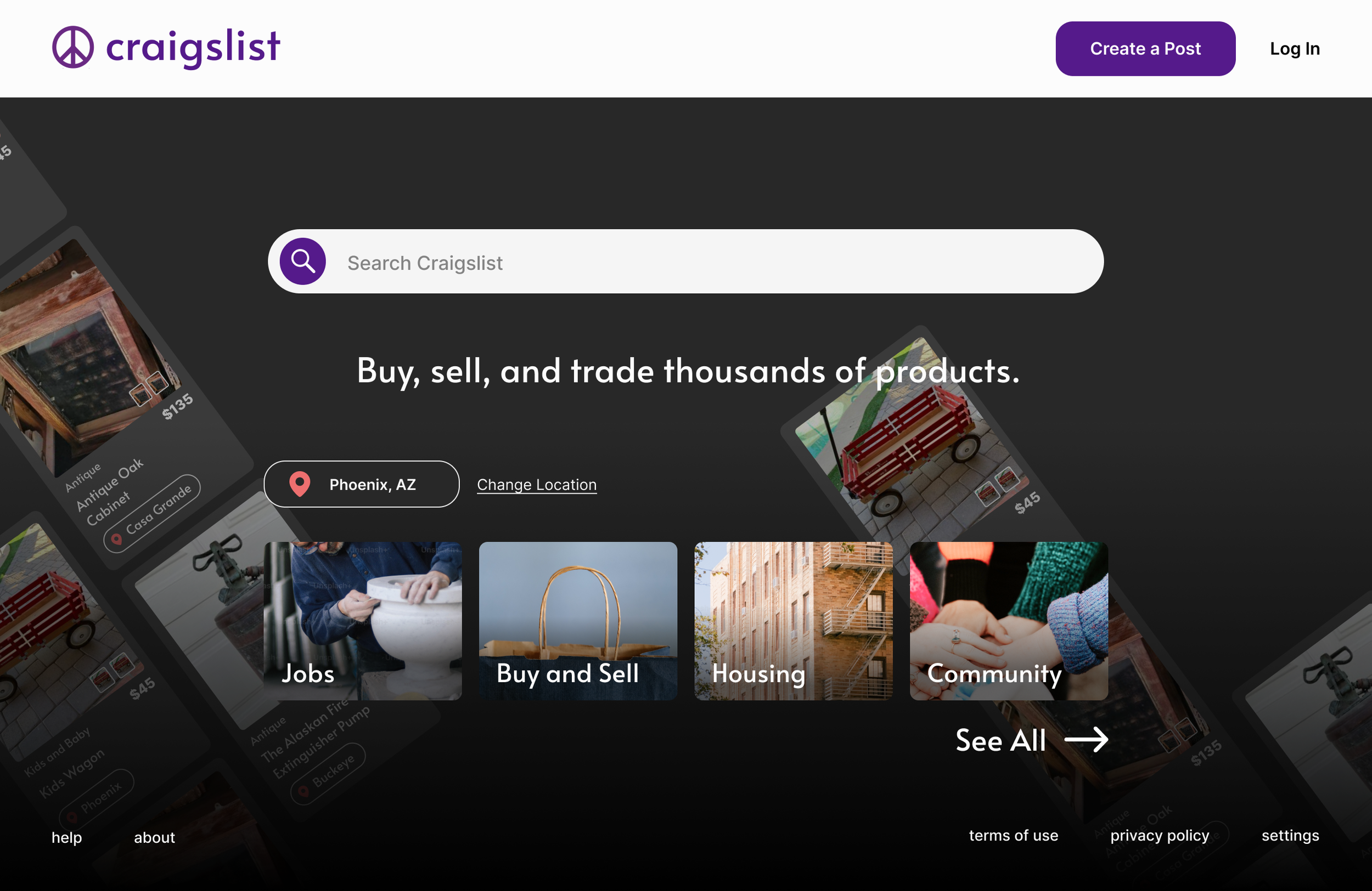
The new home page emphasizes the search feature, rather than presenting the user with an overload of information.

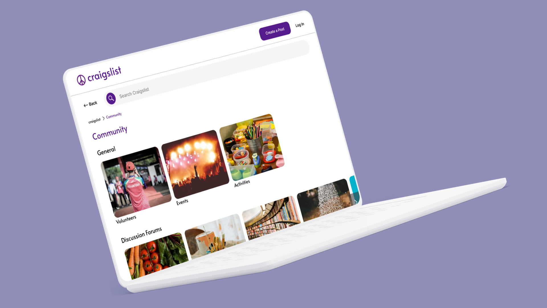
The category pages are simple and modern. Users are informed of their place in the app with clear page titles and breadcrumbs.
Our Process
Discover - Define Problem, Scope, and Audience
Scope: This was a collaborative academic project. I worked as a UX designer alongside peers, contributing to research synthesis, ideation, wireframing, and prototyping. The features included in the project scope was to design the site home page, and a category page (Ex. Community).
The tools we used included Figma, Miro, Google Docs, and Optimal Workshop.
Our primary users were everyday people - ranging from tech-savvy to first-time visitors - who wanted to browse products and create posts. Our designs needed to serve users of varying digital literacy levels.
Solve the Problem
We created artifacts such as personas, completed mapping exercises and card sorting, and conducted a heuristic analysis as part of our problem solving.
We then tested and iterated designs based on user and peer feedback.
Impact
Added breadcrumbs, active state indicators, and intuitive grouping to improve navigation. Improved visual hierarchy while maintaining Craigslist’s minimal aesthetic. Users responded well, with a 15 percent decrease in time taken to locate essential features.
Discover
UI Audit
We conducted a heuristic evaluation of Craigslist’s existing interface, identifying major pain points in navigation, layout, and system feedback.
We discovered…
Pages not clearly branded
Current state not represented well
Home page lacks visual hierarchy
current state
User Research
Through user interviews and observational testing, we learned how users browse and post listings- and where they feel confused or frustrated in the process.
From our testing we were able to define action items for our team.
Emphasize the search ability of craigslist as the primary feature
Use familiar terminology for categories
Modernize site by updating typography, buttons, and icons.
Restructure navigation using a hierarchical structure
Reduce the amount of information the user encounters on home page
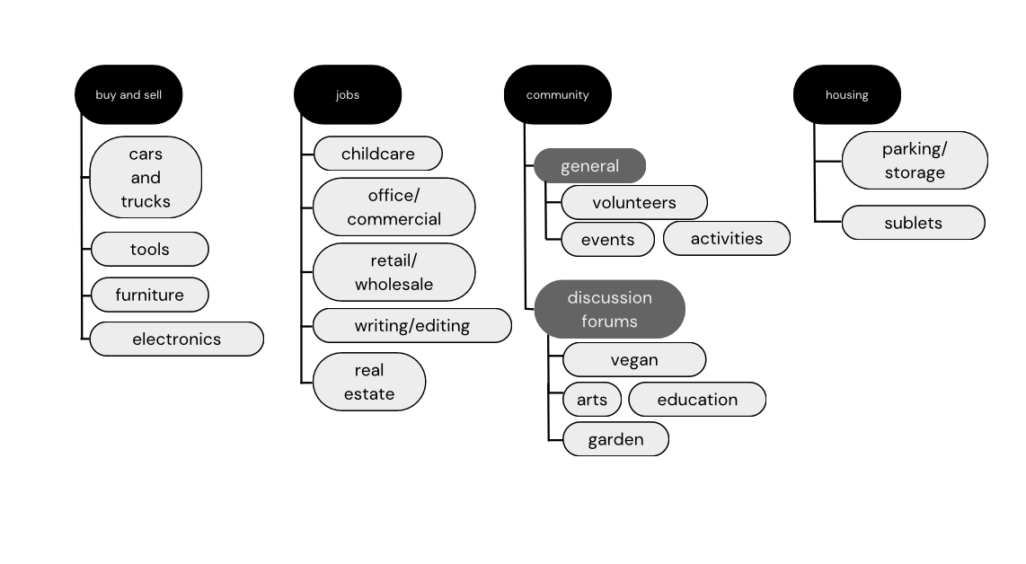
Card Sorting and Architecture Mapping
We ran a virtual open card sorting activity to understand how users mentally group categories.

Then, we created a high-level site map to visualize the structure that would be preferable based on user feedback in card sorting.
Design
Sketching and Ideation
The design team sketched out ideas for home page layout concepts focused on simplifying navigation and improving clarity. Our team completed a Crazy 8s UX exercise to iterate quickly.
Wireframes
Using insights form our research, we built low- and mid- fidelity wireframes that introduced features like breadcrumbs, clearer category groupings, and consistent visual hierarchy.
Mood Boards
Additionally, our team created mood boards to show the visual direction of the updated site.

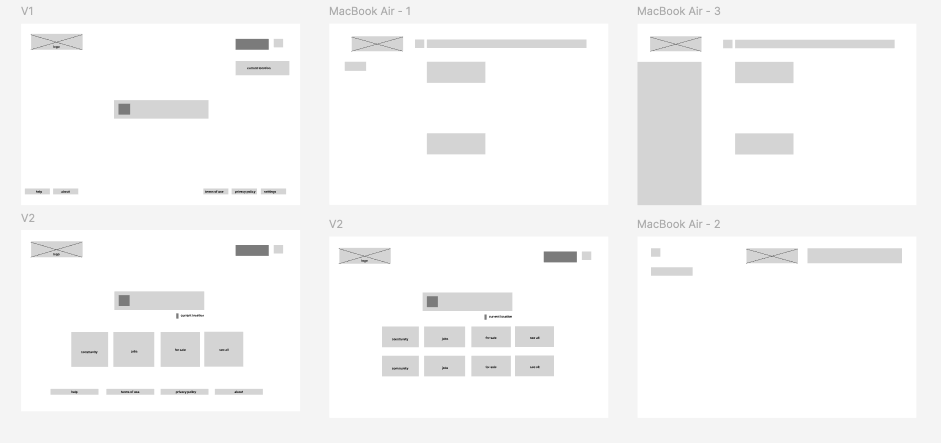
High-Fidelity Wireframe - Post Ideation

Our first iteration addressed concerns like
Emphasis on search functionality
Display fewer items on homepage
Modernize UI
But we still needed to address…
Navigating to secondary pages
Displaying categories
Solution
High Fidelity Mockups and Impact
Designed Craigslist to have an improved navigation, clearer information architecture, and a modern UI.